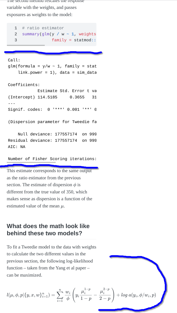
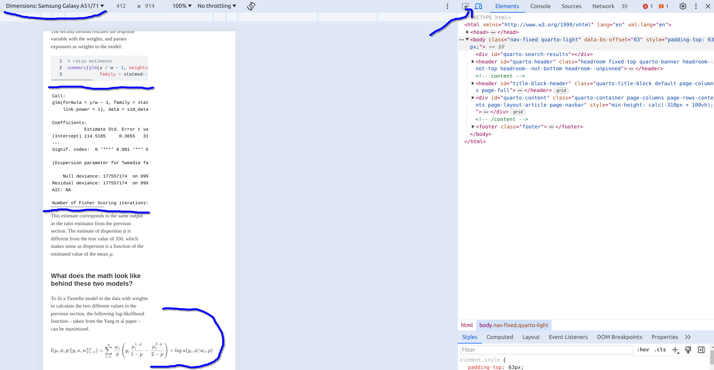
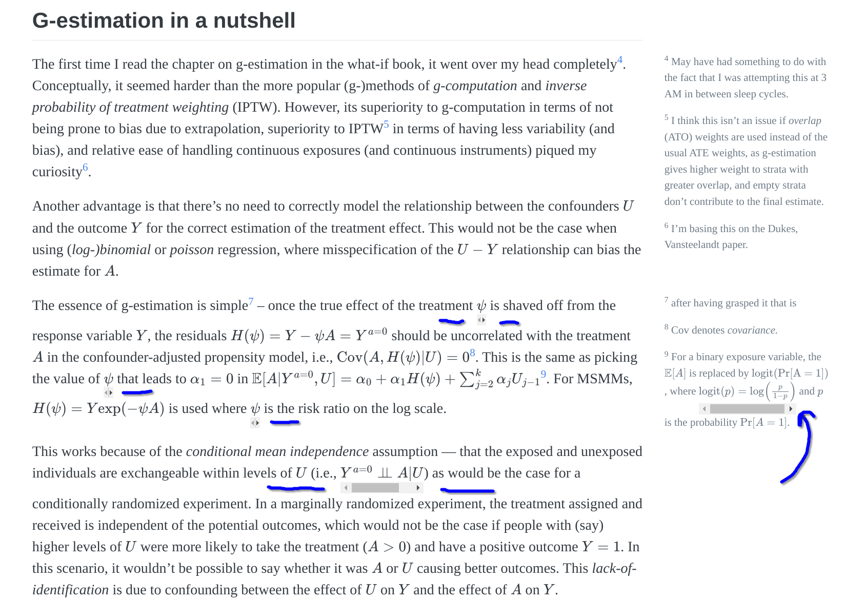
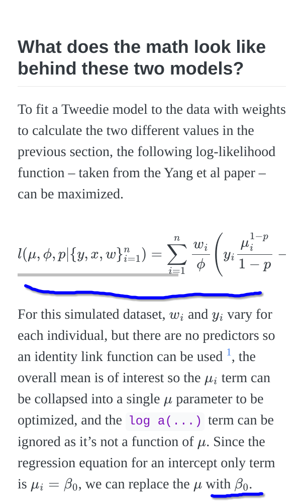
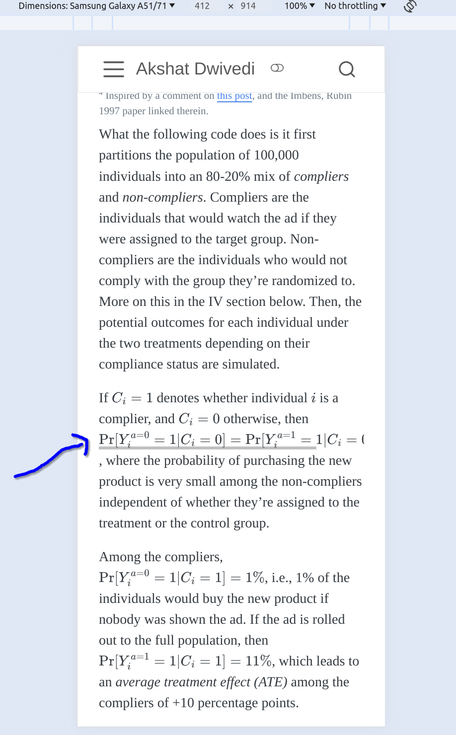
While writing new posts, I preview them on (Google) Chrome on my laptop before publishing. The three people who read my blog posts usually read them on mobile. So one fine day I decided to check what the posts look like on mobile, and I found something mildly annoying
The long math equation makes the page wider on mobile and adds whitespace to the rest of the page. This is not the case with code and output blocks, which are automatically put in scrollable containers if their width is larger than the screen width.
Which made me wonder — how can I do this for math equations as well? It definitely seemed possible from looking at Wikipedia. Thus began a three-day journey into the dark art of tweaking CSS files.
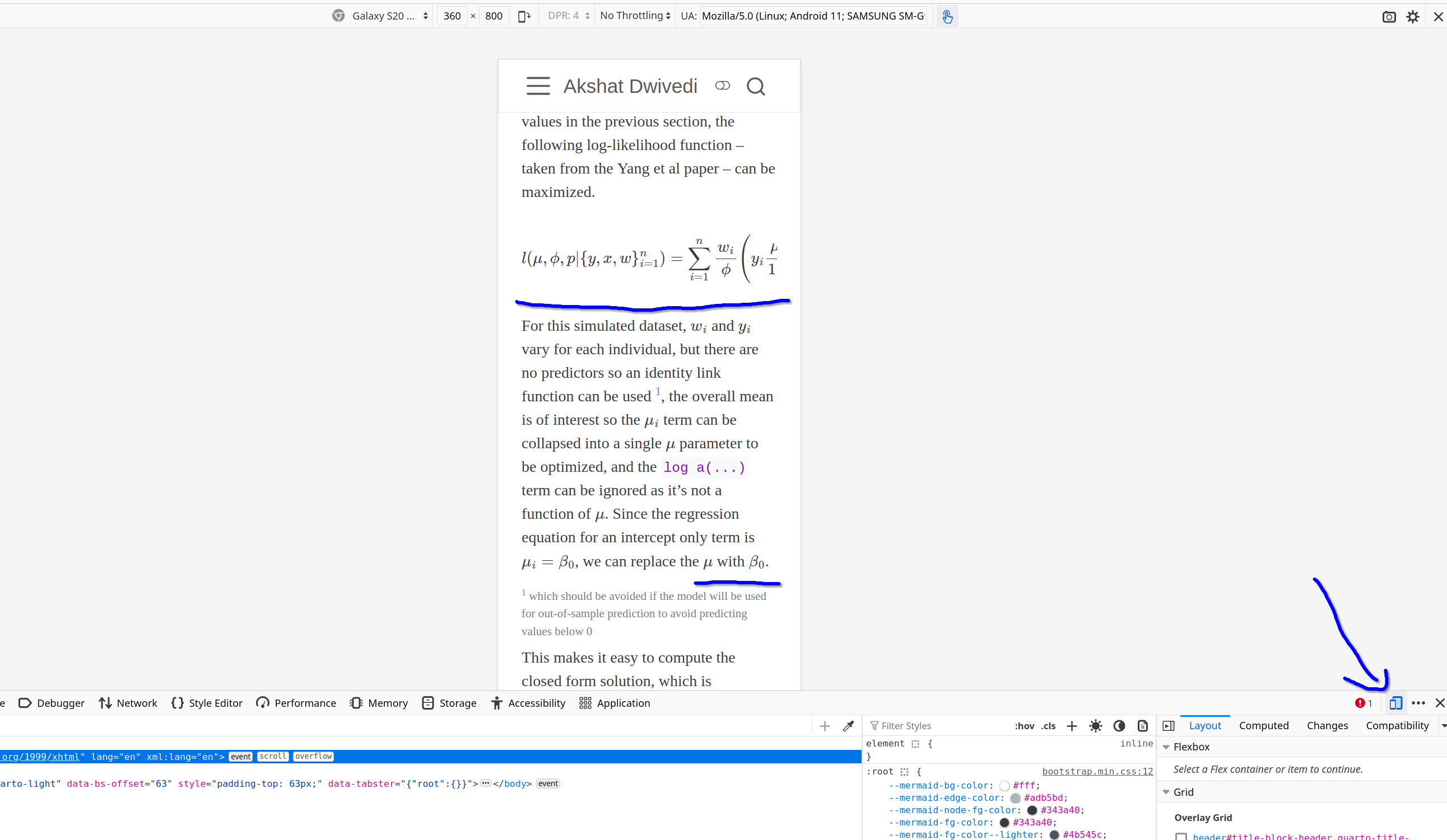
The most helpful thing I learned in this process is how to (pre)view posts — as they would show on mobile screens — on a laptop browser1
1 What’s cool is that it’s possible to see how it would render on different handsets.
Until quarto 1.4, there seems to be no parameter that can put a scrollable box around the math equations (for code it’s as simple as specifying code-overflow: scroll in the YAML post header, or more generally, the _metadata.yml file).
After some googling, I came across this solution
but I wanted something that would automatically apply to all posts.
The styles.css file in the root directory seemed to be the place to specify that MathJax should render long equations in scrollable containers. Based on this stackoverflow answer, I added the following code to the styles.css file (mjx-container is recommended for MathJax version 3, which is what Quarto seems to be using)
This fixed the equation overflow issue on Firefox2 (version 123.0)
2 which has ‘mobile mode’ as well in developer tools
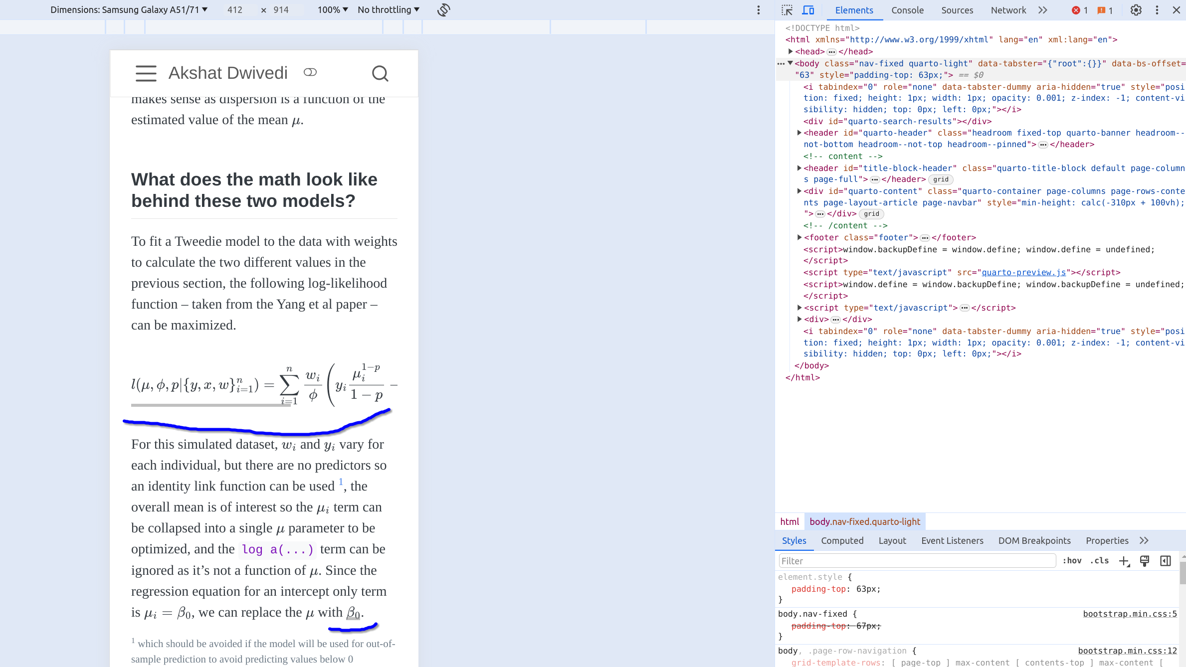
but left ugly scroll bars in inline math in Chrome both on mobile (see the scroll bar under \(\beta_0\))
and on desktop3
3 (version 122.0.6261.94)
which looks horrible. Changing to display: inline-grid didn’t lead to any visible changes, and to display: block led to all inline math getting rendered in separate blocks.
After some more googling, I came across this suggestion
which fixed the unnecessary inline scroll bar issue (on Chrome)
and continued to have scroll bars for long display mode math equations (on Chrome)
However, this was not an ideal solution, as any long inline math equation on mobile would now overflow the page
whereas scroll-bar-on-inline-overflow would’ve been ideal, if it didn’t put unnecessary scroll bars elsewhere
Since I was a bit sick of this exercise, it was quite simple to track down the few long inline equations in some of the already published posts and change them from inline to display mode so they wouldn’t overflow the page4, and add a note to self to not use long inline equations for future posts.
4 which may still overflow on very small (mobile) screens
To recap, the ideal solution would’ve been one that puts scroll bars on long inline and display math equations if they overflow the screen (depending on the device type), but not put scroll bars where the text clearly fits on screen.
